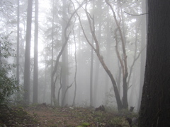
Last weekend I had some spare time, a picture and a bit of inspiration and decided to redesign my website. The reason it has taken me so long to create my own design is that, simply put, I’m not a designer. I usually don’t know where to begin and how to get the design to flow correctly. I mean, I know good design and can even sometimes spit out things that are viewable, but I’m no designer.
So where did I start? <Leans back in chair> It all started a couple weeks ago when my Dad and I decided to go hiking up at Sanborn Park. Originally we were going to go Jeeping, but it had just rained the night before and his Jeep doesn’t have a winch yet, so we went hiking instead. The conditions were perfect and I was able to snap a few pretty good pictures. Out of the set, I was really drawn to the misty trail image. I liked it so much I decided to play with it in GIMP and afterwards decided to design my entire site around it. Once I had the picture, the rest of the site practically designed itself.
So browse around and let me know how you like it. I’ve also added some cool new Web 2.0 features:
- All links have a new animated fading rollover effect pulled in from the CSS and animated with YUI.
- This is part of an API I’m building in order to keep presentatin separate from the JavaScript. More on this soon!
- The tagline text fades into view when the page loads. I plan to add more random statements over time — any suggestions?
- Comment submission is now done with XHR. I plan to make this more robust in the future.
- And of course, shiny title bars.
The fading effects and XHR comments were all built with the YUI libraries.

Awesome new design, man! I really dig the smooth text fades. And the coloring of the misty trail pic at the top left is really nice – spooky, haunting, yet alluring. Kinda makes me feel like my soul is being drawn into it and…. aaaaaaaaahhhhhhh!!! (soul gets drawn in)
Congrats on the new design, looks very sharp and clean.
trucos juegos casinos…
breadboxes Halstead disillusionment:…