Category Archives: Usability

CSS Only Placeholders Field Labels (i.e. Float Labels)

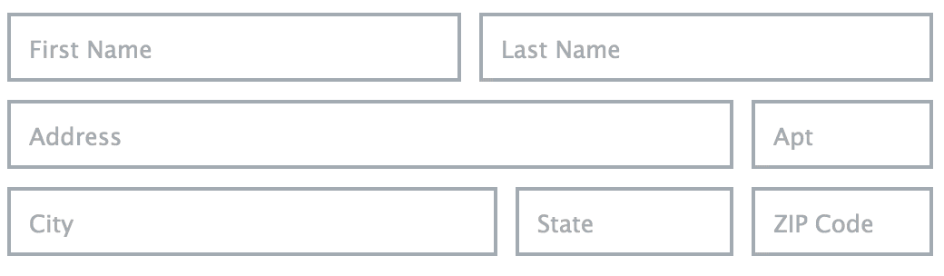
In a previous post I showed how I made the float labels for Nest’s store, which can make forms with placeholder labels more user friendly.

Click for the live demo

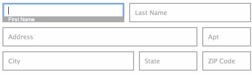
One of the glaring problems with the solution was that it required JS to work. Shortly after posting I realized that there was a very simple way to make this work without JavaScript for browsers that support the adjacent sibling selector. All you need to do is put the label after the field and then add a couple lines of CSS. In short

HTML

<span class="field">
   <input type="text" id="fname" name="fname" placeholder="First Name" />
   <label for="fname">First Name</label>
</span>

CSS

.field label {
  display: none;
}
.field input:focus ~ label {
  display: block;
}

This assumes that you have styles already defined for how you want to present the label. See the demo for the full code.

Persisting Labels

If you want to make the float labels persist after the user leaves the field, you can use the CSS3 :valid pseudo class along with the required attribute. When you put a required attribute on a field, the browser will mark it as ‘valid’ if it is not empty. This way we can show the float label when the user has entered something in the field.

Click for the live demo

HTML

<span class="field">
   <input type="text" id="fname" name="fname" placeholder="First Name" required />
   <label for="fname">First Name</label>
</span>

CSS

.field label {
  display: none;
}
.field input:focus ~ label,
.field input:valid ~ label {
  display: block;
}

Full Demos

To see both of these in action:

Good UX for Placeholders as Field Labels (i.e. Float Labels)

Checkout my follow-up CSS only solution

UPDATE: My floating labels were featured on CSS Tricks!

I know that it is well understood that using placeholder labels are bad practice. However, they continue to be used because they make forms appear tight, and responsive for mobile devices. Unfortunately, in practice they don’t provide a very good user experience.
Continue reading Good UX for Placeholders as Field Labels (i.e. Float Labels)

Make Sure You’re Site Says “Hello” to New Users

I can’t tell you how many sites I’ve stumbled on which do not tell me who they are on their homepage. Yeah they have a cool design — BUT WHAT DO YOU DO? This is more common on (sadly) open source project websites, but I’ve also seen them on sites which are trying to sell some sort of Enterprise software. I’m sure if I dig deep enough I’ll find out who you are, but I just don’t have the time.

An example I saw today, and what compelled me to write this post, was when I dropped in on the PunBB website (http://punbb.org/). It tells me “It’s called PunBB. It’s the only way to fly.”, hmmm, OK sure, whatever that means. Then the main column part of the page is News, with the developers talking about milestones and progress and other stuff they’re doing on this mysterious product. Why wont you just come out and tell me who you are? When you finally look around and discover the “About” link, you find out that “PunBB is a fast and lightweight PHP-powered discussion board.” Oh, why didn’t you say so?

PunBB Website

This is a perfect example of poor design and user interaction. As a web developer or designer you should always ensure that the user immediately understands what you do as soon as they hit your site. Don’t waste your homepage with talking about progress and milestones; put that on another page. At most you should only have the latest update on the homepage and all other news on a dedicated page. If you forget this many users will come, glance around the homepage, be confused and run away with a negative feeling about your website. This is dangerous because that feeling will last and can mean they’ll never use your service or product.

PHP Nuke (http://phpnuke.org/) is another example of this. This site does have a tagline, although you might have to look for it: “Professional Content Management System – Official Website”. Unfortunately that’s the last bit of coherent content you’ll find. So tell me more about this professional CMS. Half the links send me to pages with content which doesn’t help me at all. Cut down on the links and the noise. Put the most important information and links for new users at the top.

Don’t fall into the same bad habits. Take time and care to make sure your homepage is clear, self explanatory and easy to navigate — you know what they say about first impressions.